Project Overview
Client: Organic food brand "NATURA" (conditional or real name).
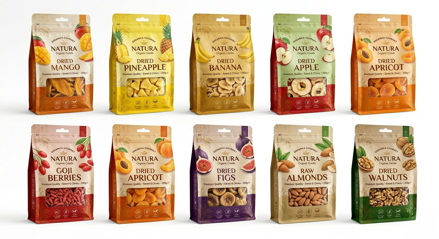
Task: Develop the design of a line of six-seam bags for dried fruits and nuts, consisting of 9 unique SKUs.
Main Concept: Create a cohesive product series where each packaging is visually connected to others through a common composition, font pairs, and basic graphics, while also being individual due to personalized color coding and food zone.
What Has Been Done (Work Stages)
Market Analysis and Shelf Audit: Competitors in the premium and mid-segments of healthy snacks were researched. A trend towards eco-friendliness, ingredient purity, and visual transparency (demonstration of the actual product) was identified.
Development of a Unified Visual Architecture: A rigid modular packaging grid was created. Sustainable elements for the entire line were defined: placement of the brand logo, a block with the Unique Selling Proposition (USP), icons of product benefits ("Sugar-free", "Gluten-free", "100% Natural"), and a lower ornamental block.
Color Coding (SKU Differentiation): A unique complementary palette associated with each specific product was selected for each of the 9 items:
Mango — juicy orange-yellow
Pineapple — bright yellow
Banana — mustard-gold
Apple — deep red-green
Dried Apricot — warm apricot
Goji Berries — coral-red
Fig — rich purple
Almond — soft nutty beige
Walnut — deep grassy green
Food Styling and Illustrations: Realistic food illustrations of fruits and nuts in cross-section were developed for each item, adding dynamism and appetizing appeal.
Integration of a Transparent Window: An important element of the architecture was a transparent window at the bottom of the bag, allowing the customer to assess the quality, texture, and caliber of the dried fruits or nuts before purchase.
Adaptation to Shape (Six-Seam Bag): The design was created considering the specifics of forming a six-seam bag (stabilo bag). The side edges are used for technical information, ingredients, and additional branding elements, making the packaging informative from any angle of view on the shelf.
Result
A modern, commercially attractive, and systematic line of packaging has been created, which effectively works as a single brand block on the supermarket shelf. The design clearly communicates the idea of naturalness, high quality, and facilitates consumer navigation between flavors within the series.
Client: Organic food brand "NATURA" (conditional or real name).
Task: Develop the design of a line of six-seam bags for dried fruits and nuts, consisting of 9 unique SKUs.
Main Concept: Create a cohesive product series where each packaging is visually connected to others through a common composition, font pairs, and basic graphics, while also being individual due to personalized color coding and food zone.
What Has Been Done (Work Stages)
Market Analysis and Shelf Audit: Competitors in the premium and mid-segments of healthy snacks were researched. A trend towards eco-friendliness, ingredient purity, and visual transparency (demonstration of the actual product) was identified.
Development of a Unified Visual Architecture: A rigid modular packaging grid was created. Sustainable elements for the entire line were defined: placement of the brand logo, a block with the Unique Selling Proposition (USP), icons of product benefits ("Sugar-free", "Gluten-free", "100% Natural"), and a lower ornamental block.
Color Coding (SKU Differentiation): A unique complementary palette associated with each specific product was selected for each of the 9 items:
Mango — juicy orange-yellow
Pineapple — bright yellow
Banana — mustard-gold
Apple — deep red-green
Dried Apricot — warm apricot
Goji Berries — coral-red
Fig — rich purple
Almond — soft nutty beige
Walnut — deep grassy green
Food Styling and Illustrations: Realistic food illustrations of fruits and nuts in cross-section were developed for each item, adding dynamism and appetizing appeal.
Integration of a Transparent Window: An important element of the architecture was a transparent window at the bottom of the bag, allowing the customer to assess the quality, texture, and caliber of the dried fruits or nuts before purchase.
Adaptation to Shape (Six-Seam Bag): The design was created considering the specifics of forming a six-seam bag (stabilo bag). The side edges are used for technical information, ingredients, and additional branding elements, making the packaging informative from any angle of view on the shelf.
Result
A modern, commercially attractive, and systematic line of packaging has been created, which effectively works as a single brand block on the supermarket shelf. The design clearly communicates the idea of naturalness, high quality, and facilitates consumer navigation between flavors within the series.