The client Crocus Home Decor needed not just a "business card website," but a full-fledged trading platform that:
Will withstand active advertising traffic.
Will be user-friendly from any device.
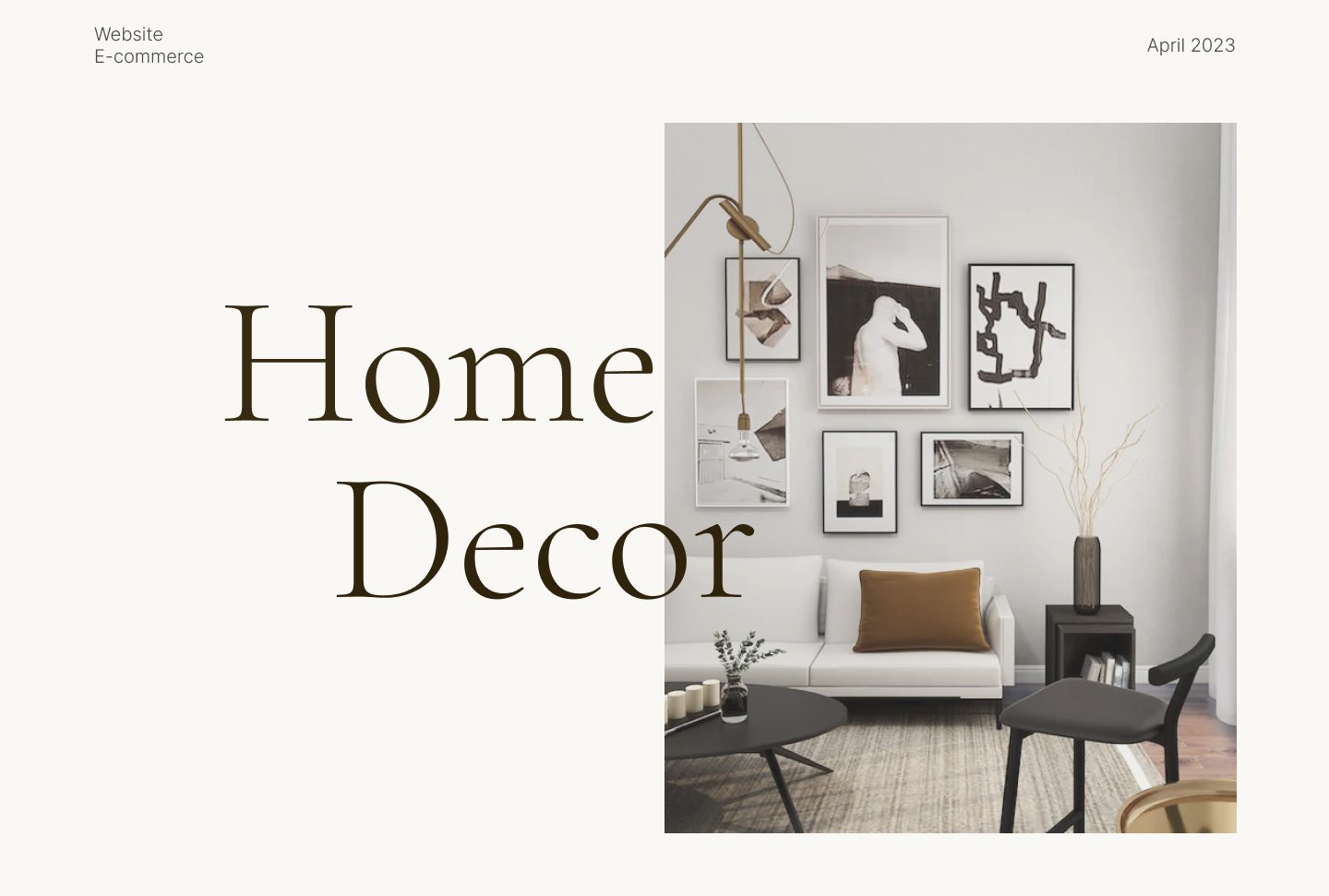
Will highlight the aesthetics of the products (decor, textiles, tableware) without distracting attention with unnecessary elements.
2. Solution from Duky-Ducky (Technical part):
We chose WordPress + WooCommerce as the most flexible solution for e-commerce, allowing for easy scalability.
Multilingualism: Full support for multiple languages has been implemented to reach a wider audience.
Smart filtering: A filtering system (by color, material, price, purpose) has been implemented, allowing the customer to find the desired vase or blanket in 3 clicks.
Seamless payment: Integration of a payment gateway for instant online payment (Apple Pay / Google Pay / Card).
3. UI/UX Design (Visual part):
We followed the principle "Design should not hinder purchasing."
Style: Clean Minimal. Lots of "air" (white space), elegant font pairs, and a restrained color palette. This creates the effect of an expensive boutique.
Focus on content: The main star of the site is high-quality product photography. The interface serves only as a convenient frame.
Mobile First: Since 80% of traffic comes from Instagram/TikTok, the mobile version of the site is designed down to the pixel — with convenient large buttons, an adaptive menu, and fast loading.
Result:
The site has become a reliable foundation for marketing. The page loading speed.
Will withstand active advertising traffic.
Will be user-friendly from any device.
Will highlight the aesthetics of the products (decor, textiles, tableware) without distracting attention with unnecessary elements.
2. Solution from Duky-Ducky (Technical part):
We chose WordPress + WooCommerce as the most flexible solution for e-commerce, allowing for easy scalability.
Multilingualism: Full support for multiple languages has been implemented to reach a wider audience.
Smart filtering: A filtering system (by color, material, price, purpose) has been implemented, allowing the customer to find the desired vase or blanket in 3 clicks.
Seamless payment: Integration of a payment gateway for instant online payment (Apple Pay / Google Pay / Card).
3. UI/UX Design (Visual part):
We followed the principle "Design should not hinder purchasing."
Style: Clean Minimal. Lots of "air" (white space), elegant font pairs, and a restrained color palette. This creates the effect of an expensive boutique.
Focus on content: The main star of the site is high-quality product photography. The interface serves only as a convenient frame.
Mobile First: Since 80% of traffic comes from Instagram/TikTok, the mobile version of the site is designed down to the pixel — with convenient large buttons, an adaptive menu, and fast loading.
Result:
The site has become a reliable foundation for marketing. The page loading speed.