Main page for the online school website
Web Design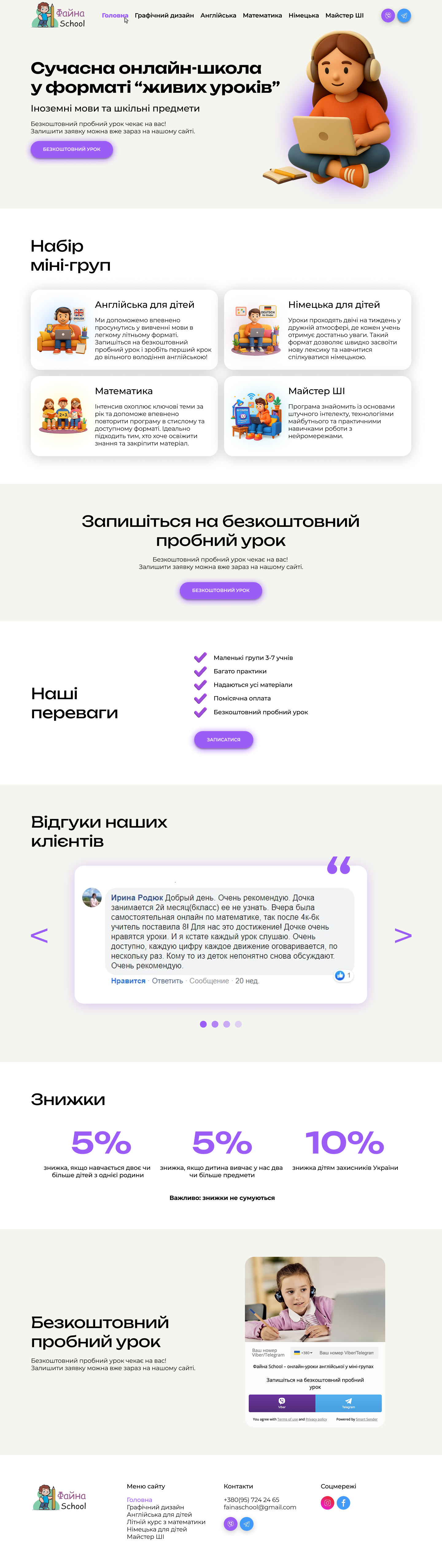
I implemented this project for an online school that offers foreign language courses and school subjects in the format of "live lessons." My task was to develop the design of the main page as part of a cohesive website system.
Goal: to create a structure that briefly and clearly presents the school, helps users quickly navigate the learning options, and motivates them to leave an application for a trial lesson.
What I did:
Formed the page structure with a clear hierarchy:
• Welcome block with Unique Selling Proposition (USP) and Call to Action (CTA)
• Course categories in card format
• Highlighted advantages of the school
• Testimonials from real parents
• Information about discounts
• Final block with a call to action
Used a warm, friendly visual style within the overall school brand: 3D illustrations, soft color palette, large spacing, and readable typography.
Optimized content presentation — made it concise, understandable for parents, and at the same time lively and emotional.
Included repeating CTA elements (calls for a trial lesson) at key points on the page to increase conversion.
Ensured responsiveness of all elements — the page works equally well on mobile and desktop devices.
Result:
The main page functions as a navigation hub and the first impression of the brand. Thanks to a thoughtful structure and friendly visuals, it effectively guides users to leave an application and encourages exploring the school's courses.