Wardrobe analysis
Banners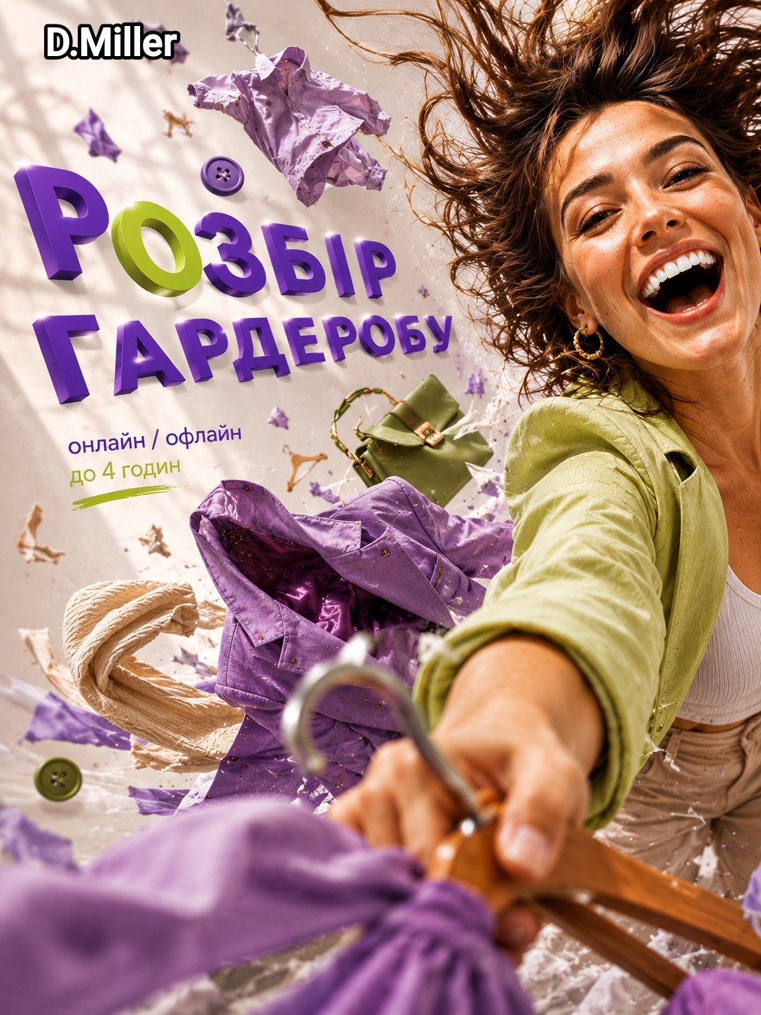
Wardrobe Analysis
How I Turned a Static Banner into a Story of Movement
When I first saw the original layout, I thought it explained the service well, but it didn’t evoke any emotions.
The banner featured a girl, text, and a list of what the service includes. Everything was clear, but there was nothing for the eye to catch. The viewer simply looked at the information.
I wanted to change the way it was perceived.
Instead of describing the wardrobe analysis through a list of benefits, I wanted to show the feeling a person gets after this service.
---
Idea
During the work process, I came to a simple thought:
Wardrobe analysis is not about clothes.
It’s about the transition from chaos to order.
When there are many items, they seem like a random collection of objects. After analysis, a system emerges, an understanding of one’s style, and confidence in what to wear and buy.
I decided to embed this idea into the composition itself.
---
What I Changed
First of all, I abandoned the static pose of the character.
I wanted the girl not to stand inside the layout but to literally break out of it.
Thus, dynamics, movement forward, and interaction with the viewer emerged.
The hanger was brought to the foreground and directed straight at the camera. Thanks to this, the viewer stops being an observer and becomes a participant in what is happening.
---
Visual Path
I paid special attention to the movement of the gaze.
It was important to me that the objects didn’t just fly around the character but helped tell the story.
Therefore, the clothes and accessories were arranged in a sequence:
Blazer → Bag → Scarf → Hanger → Button
As the movement progresses, the objects become simpler and smaller.
Thus, the composition gradually leads the gaze to the headline and helps convey the idea of transformation.
---
Working with Typography
I didn’t want the headline to look like a separate block of text.
So the letters became part of the space.
They are directed into the scene and work together with the movement of the character and objects.
For me, this was a way to unite graphics and story into one system.
---
Result
In the end, it turned out to be not just an advertising banner.
I wanted to create a sense of movement, choice, and change.
So that the viewer not only understood what the service was about but also felt the result even before reading the text.
Essentially, this project became an exercise in visual storytelling — an attempt to tell a story through composition, movement, and interaction of objects within the frame.