****************************************************************************************************************************************************************************************************************************
Good day, I hope you are well.
So, here’s what is needed for the next capsule.

Players often say that this capsule is drawn by artificial intelligence, and if we disregard all the hysteria about AI today, I would like to draw a new capsule that looks as if it were drawn by a "live person," so that players do not perceive it otherwise.
I think one of the important things to redo is to remove the harsh emotions of the customers—like fear, screaming, laughter, etc.—because they look a bit unnatural and make the image surrealistic.
Also, let’s change the drawing style from what we currently have, focusing more on the reflections and shadows of the characters—they look a bit "waxy" and three-dimensional. Both of these things I initially asked to be done, but they seem to miss the genre and are perceived negatively by players. (There is a mismatch between the tone of the game and the capsule—the capsule suggests it’s a trashy horror where mutants chase customers).
Another thing that might give them the impression that this is AI is the font with the game title on the TV—it seems unnatural to them because it looks like "objects are not integrated into the context of the situation, as if a text was supposed to be added and a TV appeared out of nowhere." I personally don’t think so, but I believe that the contrast of products and the screaming faces just add to this atmosphere of absurdity, and therefore people seek additional evidence.
Let’s make the letters more naturally integrated into the capsule, as is customary in other games—I suggest writing in neon letters on a black background, imitating a store wall.
There’s also a point regarding colors—I wanted it to be this way, but it seems players find the various color combinations too much—like green plus blue and black they do not read, the idea of "oh, here are bad products, here are good ones" is also not readable.
This is regarding the previous capsule. Now I will explain what I want in the new one.
Also, judging by everything, my idea to add strange products on the shelves is perceived by players as "AI threw in all sorts of trash absolutely without context."
So, to summarize what needs to be changed:
1. Remove the screaming faces with various "silly" emotions.
2. Remove "products without context."
3. Remove the text in the green body.
4. Draw the next capsule "not in the style of AI graphics," whatever that means (I think here they mean that I asked to make the characters more 3D, and these highlights on the 2D image make them look waxy and AI-like.
Now I will write what else I would like in the new capsule and suggest options:
In the new capsule:
1. I changed the very structure of the plot. I need the new capsule to convey to the player "how to play this."
I think the player should look at the capsule and immediately understand what the game is about. Right now, if you look at the current capsule, it looks like this game is about "running away from a monster chasing you in a supermarket."
Then, for those players who are interested (like in a trash-action format), they will see screenshots and realize that this is a novel and economic game—and they will drop off.
Let’s show the following plot in the capsule this time:
"Guess what kind of customer is in front of you."
I imagine it like this: a girl-seller stands behind the counter, and it shows that she is thinking about what decision to make—whether to sell the product or not.
The girl, because most of the audience interested in this game are mid-core female players. I also suggest: let’s make her a robot (just a slight hint that she is a robot)—to still acknowledge that the game has a trash atmosphere, and it’s not just a goat-simulator store, but something truly strange is happening.
This girl-robot, meaning we, the player, stands behind the counter and thinks whether to sell products to this customer or not.
In front of her are two buttons—a red one and a green one. There is also a bell with which she calls the next customer.
I would also really like to convey this additional moment that the girl has information about the customer, but in Steam, you cannot write any texts on these pictures except for the game title.
Then, perhaps, this girl could have some "scales" or some "scanner" or just some device that shows how safe, wealthy, or good this client is—I don’t know.
The essence is that in the picture she should stand thoughtfully and evaluate which button to choose. (Ideally, we should see that she evaluates the client not "like in Tinder," but more rationally—thinking whether to sell products to this person for this specific amount, or something like that.) But if it’s just a swipe left, swipe right, maybe that’s okay too.
Just perhaps on a larger scale of the capsule, I would show hint items that suggest she is not just swiping:
For example, her store is almost closing, and next to her is a jar with money that is empty and needs to be filled.
Now the client
The client should be the main focus of the picture—he is, so to speak, my "store crush." That is, he should be interesting, mysterious, and prompt action.
An important nuance—this time, for the sake of maximum success of the capsule, you can choose and draw any clients. Even invent those who are not in the game. The player too—whoever you imagine for the success of this picture.
I think that since we can change the skins of characters in the game, let’s not show three characters including the monster this time, but draw the character as the most mysterious crush. That is, he:
1. Looks like a man but has feminine features in his face, maybe I don’t know, made-up eyes, an earring, etc.—a bit androgynous or metro.
2. Also, this client has one strange feature that gives him away as an alien—for example, he has a different nose, maybe different skin or eyes, I don’t know.
He should read as a "mysterious client"—hmm, what’s up with him, maybe this is a woman? And what about his "nose"? In short, the player should spend some time in the body of this girl, genuinely sympathizing with her and thinking: God, who is this that has come.
3. The client should show some strong emotion because we see his face, but not a silly one (as players say). I think maybe he will be like, slyly smiling, like "yes-yes-yes, I just need rat poison and a bit of mineral water, hee-hee-hee, nothing else needed. I’ll pay cash."
And we kind of see that he is smirking as if trying to deceive the unfortunate girl, but she is smart, she reminds us of a robot, and it’s not so simple with her either; she has information about this guy and makes her own thoughtful decision.
I’m not sure if he should show his products that he is buying in this picture. I couldn’t find a situation where this wouldn’t distract from the main focus of the image. "We guess who is in front of us."
Regarding the background itself
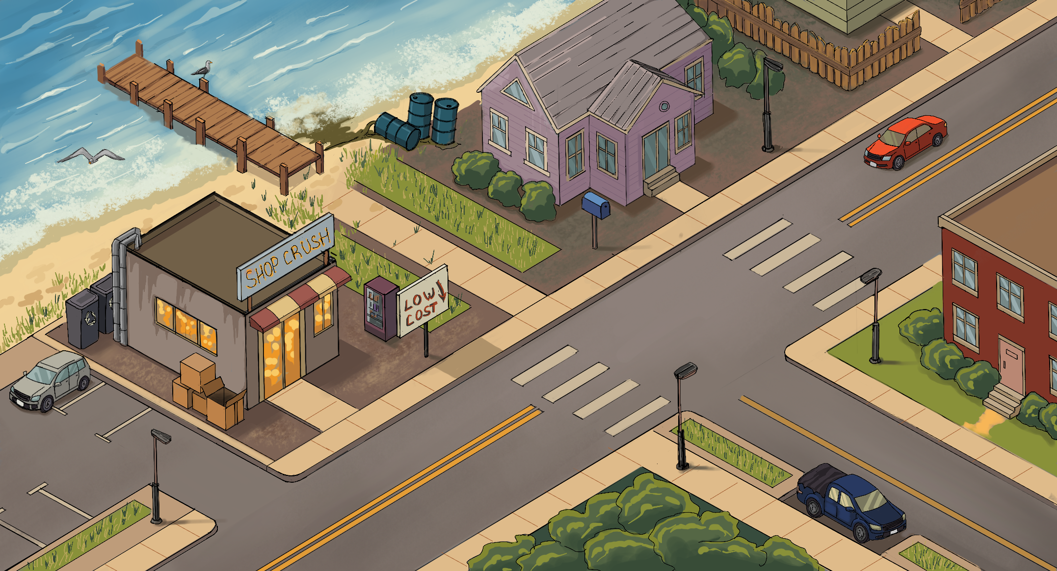
I would say: let’s take, like, our store from day one as the place where the action of this capsule takes place. It’s a beach town. The main emotions that this store and this capsule evoke in general are pleasant nostalgia: "things were better back then." In the early 2000s, there was its own vibe.
I will send you how some characters are dressed and how the first store looks from above (you drew it inside).
In general, the mood of this capsule and its era should immediately read as "early 2000s," "late 90s" in America. That is, there were flip phones, characters dressed more in hip-hop style, stores were not yet soulless hypermarkets, but were starting to become so.
The time of day is like sunset, the girl is already tired, thinking about closing the store and going to the beach. Conditionally speaking.
In general, we really need a capsule that can interest the audience of "women who love life sims, are ready to play indie games, but do not expect casualness, but rather seek something interesting with soul."
I would also say that this time we do not need to draw many elements in the background because they create noise, and players also think that they are standing there randomly.
I think we need to draw the seller—a girl robot, the client—a strange mysterious crush, the buttons in front of the girl, the scene where the girl thinks whether to sell to him or not, the client standing in a mysterious pose saying "I don’t need anything," and also need *something* that shows that the client has parameters—money, cunning, I don’t know. And either a cash register or a clock—something that shows "time is running out." And that this is a "nervous situation"?
The background of the store, I think, should be shown without small details. Perhaps really just the counter, open doors, store walls, and some small elements of the store that hint that this is indeed the 2000s.

And finally: I asked ChatGPT to generate everything I told you.
The most suitable image I consider is this one that it made:
In general, I would be satisfied with just a simple replica of this image, but I’m afraid that this would indeed be an image that AI helped create.
So I laid out all the positions I wanted and ask you to make an image similar to this one, but also to create some designs so that players do not start to panic that this is AI—maybe draw everything in a technique that AI does not use.
But I think if we fix all those moments I pointed out (many of which I ironically initially asked for), it will be okay.
Just make it as non-AI as possible so that the player cannot throw it at the game when looking at the preview trailer or the beginning of the Steam page.
And also, sorry for the long text—I wanted to explain everything as fully as possible so that nothing falls out of context.
I also attach other variations that Shi drew—well, there you can track what exactly I think should be in this marketing image.
But, like, I consider these versions less successful for various reasons. (either too much Japanese influence, or small details, or not the right light, or not the right design, or it was done for some reason in black and white style, or not in the style of the 2000s)
But just to convey my train of thought, please take a look at them too.
And I even get comments on my creative account, even on videos of the drawing process, saying this is AI))
Well, I’ll see what can be done about this, maybe indeed simplify the style a bit
Regarding the task, it’s generally clear, I will make a few sketches with options for the client’s characteristics
It will be 3200, with a timeframe of 5-7 days depending on revisions.
This hysteria has really gotten old)
Well, I have a hypothesis that if I can show more of the gameplay process in the picture, there will be better conversions
So let’s try.