Packaging and label design
4163-
“OVA COFFEE” package of glasses-4
Packaging and label design
“OVA COFFEE” is a cocktail. Approved option
-
Barbers Professional Cosmetics
Packaging and label design
Barbers Professional Cosmetics — a line where the design looks more expensive than most men who will buy it. I created packaging for premium cosmetics that screams: "You can be tough, even if your girlfriend chooses the shampoo." Three series — New York, Original, Brooklyn — each has its own character, but without the loud nonsense that cheap brands love. I aligned the typography, tamed the colors, created a readable hierarchy — in short, I brought the order that barbers would try to achieve, but their hands are busy with trimmers. Everything is neatly prepared for printing: 400 ml bottles, 50 ml jars — no surprises in typography, except for pleasant ones.
#packagedesign #branding #premiumdesign #cosmeticsdesign #barbershop #visualidentity #graphicdesign #productlabel #portfolio #menscare
#packagedesign #branding #premiumdesign #barbershop #menscosmetics #identity #graphicdesign #labels #portfolio
-
WOOPSY – beech bedding
Packaging and label design
Bright packaging design for pet products featuring friendly characters (hamster and gecko) that emphasize the product's intended purpose. A contrasting palette, convenient doypack, and transparent window make the product stand out on the shelf and instill trust through the open display of natural filler.
-
PLNTBSD — series of neuroboosters
Packaging and label design
PLNTBSD — series of plant-based neuroboosters for AM / PM / All-Day intake.
The design solves three tasks:
Color navigation through the time of day (red / blue / yellow),
A single modular structure — seriality is read instantly,
… Absence of visual noise — no abstract icons, no pseudoscientific graphics.
Dark background — a visual metaphor for concentration.
This is a design that works not with loudness, but with logic, clarity, and respect for the user.
-
MARK Craft Spirit
Packaging and label design
The NAME LIGHT — a multi-level wordplay:
Firstly, a lighthouse — as a symbol of a landmark, a bright presence in a sea of similar alcoholic products.
Secondly, dividing the name into MA and YAK opens up space for play with flavors: MA YAK WHISKEY, MA YAK CHACHA, MA YAK GIN, etc. Such a structure is not only easy to remember but also provides endless opportunities for expanding the product line.
The visual symbol of the brand became an expressive seagull — not accidentally, because a lighthouse without a seagull is like a party without alcohol. The bird here is a metaphor for freedom, wildness, excessive attention, and loud statements (especially after the third).
… Graphic typography: the font structure of the name works as a visual hook — a large contrasting “MA” and “YAK” form the center of the composition.
Color segments: each flavor has its own color dominant — from wine red to mustard yellow. This ensures quick recognition on the shelf.
Large abstract text in the background (B, C, W, etc.) — a visual index that adds depth and creates a sense of linearity in the series.
The MAVAK logo in the form of a lighthouse beam — concise but strong brand marker.
A unique brand character has been created, combining irony, style, and recognizability.
The product line looks cohesive, but each product has its own individuality.
The ready-made design is successfully used for marketing needs and brand communications.
-
Packaging of the product Car Camera
Packaging and label design
The designer packaging of the TORSSEN camera is a true example of a creative approach to industrial branding. The main design element is a stylized image of the lens, resembling an all-seeing "eye" of a high-tech device. It is placed in the center, creating an emphasis and instantly conveying the idea of precision, quality, and reliability.
The background is executed in a rich dark red color palette with a cosmic fog effect, adding depth, mystery, and techno-aesthetics to the packaging. This choice of background hints at innovation and the future, as well as creating a sense of limitless vision — exactly what the TORSSEN camera provides.
Typography is built on contrast: a bright red color highlights key words, and a clear white font ensures easy perception. The well-integrated QR code and company website emphasize the brand's digital focus.
Each side of the packaging carries informational and visual functions — from specifications to camera models. Thus, the designer not only created an attractive visual but also transformed the packaging into an effective communication tool.
… TORSSEN packaging is a symbiosis of technological content and visual impact, which immediately distinguishes the product among competitors and creates an impression of premium quality even before opening the box.
-
Packaging design for the drink
Packaging and label design
#Packaging
-
Product Packaging Children's Cards
Packaging and label design
Product Packaging Children's Cards
-
Glazed popcorn packaging
Packaging and label design
packaging design and character
-
Packaging Design Banana Chips
Packaging and label design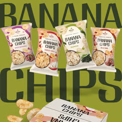
#packaging #packaging #packaging #packaging_design #designer #dakota #dakota #Chips
https://www.behance.net/7696d2ed
-
Packaging design for Testini nuts
Packaging and label design
Packaging design for a line of nuts
-
Packaging design for agricultural products
Packaging and label design
#packaging #packaging #packaging #packaging_design
behance: https://www.behance.net/gallery/207693451/Packaging-design-for-agricultural-products?
-
98AI & Machine Learning
-
7AR & VR Development
-
242Bot Development
-
63C & C++
-
84C#
-
265Content Management Systems
-
95Cryptocurrency & Blockchain
-
177Data Parsing
-
72Databases & SQL
-
121Desktop Apps
-
44Embedded Systems & Microcontrollers
-
150Gaming Apps
-
3234HTML & CSS
-
27Java
-
295Javascript and Typescript
-
486PHP
-
227Python
-
82Testing & QA
-
2462Web Programming
-
34903D Modeling
-
370AI Art
-
2280Artwork
-
7252Banners
-
2051Business Card Design
-
57Clothing design
-
2027Corporate Style
-
211Exhibition Booth Design
-
572Icons & Pixel Graphics
-
11655Illustrations & Drawings
-
399Industrial Design
-
656Infographics
-
982Interface Design (UI/UX)
-
6057Interior Design
-
13683Logo Design
-
890Mobile Apps Design
-
1541Outdoor Advertising
-
4163Packaging and label design
-
1009Presentations
-
9170Print Design
-
2085Social Media Page Design
-
43Type & Font Design
-
4030Vector Graphics
-
6VR & AR Design
-
10534Web Design
-
10AI Consulting
-
1227Content Management
-
38Customer Support
-
20Cybersecurity & Data Protection
-
60Data Processing
-
75Enterprise Resource Planning (ERP)
-
101Information Gathering
-
668Online Stores & E-commerce
-
12Payment Systems Integration
-
93Tuition
-
5003Website Development
-
169Website Maintenance
-
13App Store Optimization (ASO)
-
982Contextual Advertising
-
255Email Marketing
-
223Lead Generation & Sales
-
38Link Building
-
52Marketing Research
-
1Public Relations (PR)
-
1194Search Engine Optimization (SEO)
-
34Search Engine Reputation Management (SERM)
-
651Social Media Advertising
-
840Social Media Marketing (SMM)
-
6Teaser Advertisements
-
345Website SEO Audit